Duo Security

Project Peer Pressure (2017)

Once upon a time, Duo gave an engineering team a whole week to work on a hack project. The work described below was done within one week in collaboration with engineers and data scientists. I was the only designer on this project.

What is this mini project about?

When you are in a security industry (and generally any other industry), you look to your peers to get a better understanding of how you can secure your environment. This understanding paints a better picture of where you can improve. In a corporate context, sometimes it even helps an IT administrator (a persona we named Gary) convince leadership to invest in areas they previously didn’t think were necessary.

So we thought, what if you could compare your organization’s security posture to that of other organizations? What if you could see how many out-of-date devices you have in your environment compared to industry’s average?

Setting a scope

Since we only had a week to develop this comparison tool, we had to tackle all technical constraints first, and lay out what data we can gather and analyze. We found that we could pull the following information about customer’s environment:

  • Are devices encrypted?
  • Do devices have a screen lock?
  • Are devices rooted or jailbroken (tampered with)?
  • Are devices running an out-of-date operating system?
  • Are devices running out-of-date browsers?
  • Are devices running out-of-date plugins?

Then, we had to decide what to comparing against.

  • Company of your size?
  • Company in your industry?
  • Or company in your industry and your size?

Comparing against a single criteria wasn’t enough to paint the whole picture. If you are a company in a tech industry with 60 employees, you have a different budget for IT and security than a company with 2500 employees. We decided comparing against both criteria would provide the most benefit to our customers.

Sketching ideas

I turned to my favorite tool. Good old paper and pencil, to rapidly sketch different ideas. How could I help Gary to quickly grasp his environment, how could I tell a good story? Many stories are told in words, but Gary got no time to read

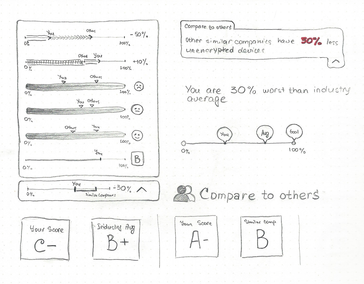
What would work best?

  • Side-by-side bar graphs?
  • A pie chart?
  • Is it valuable to show data over time?
Paper sketch of graph ideas

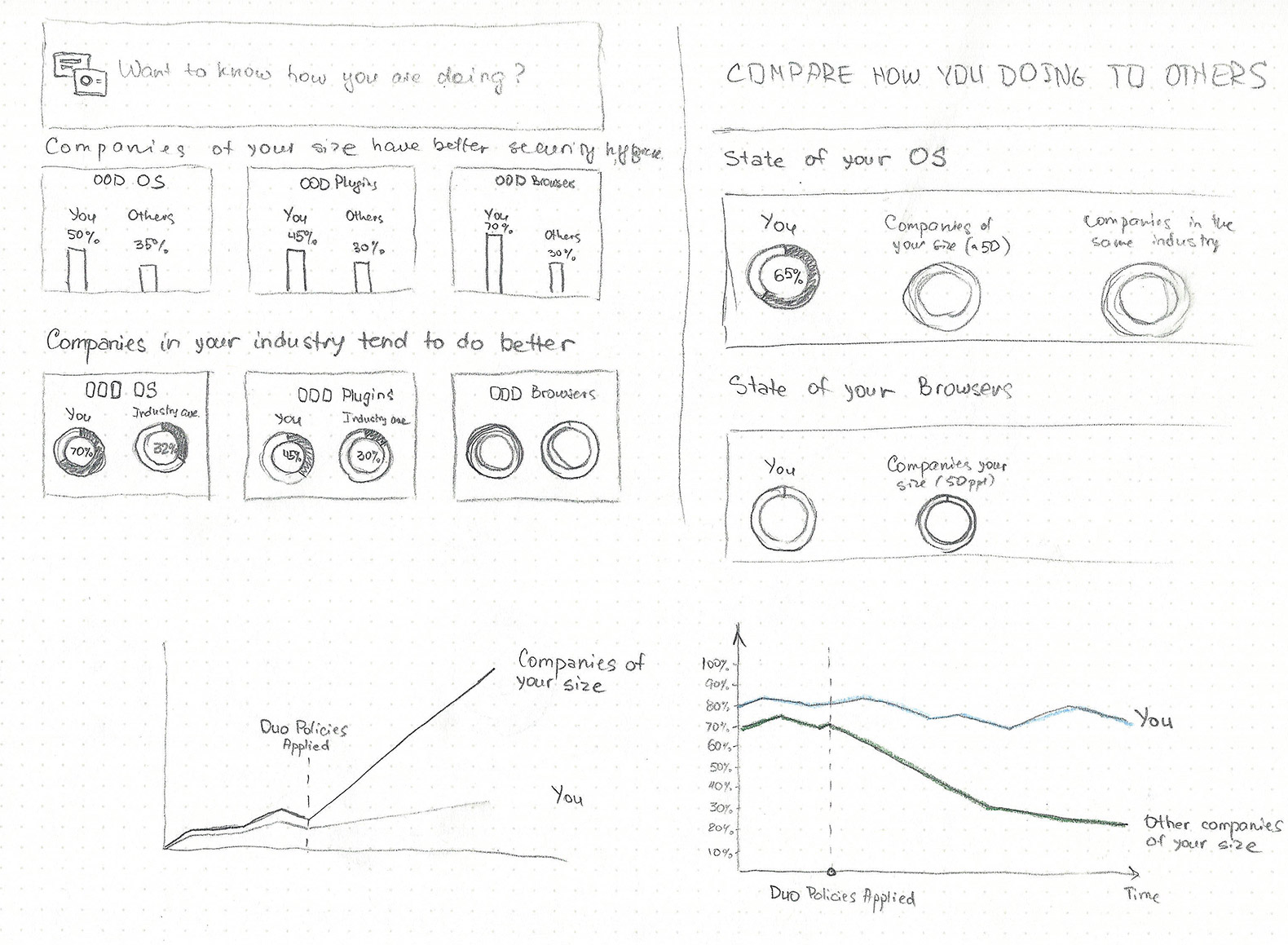
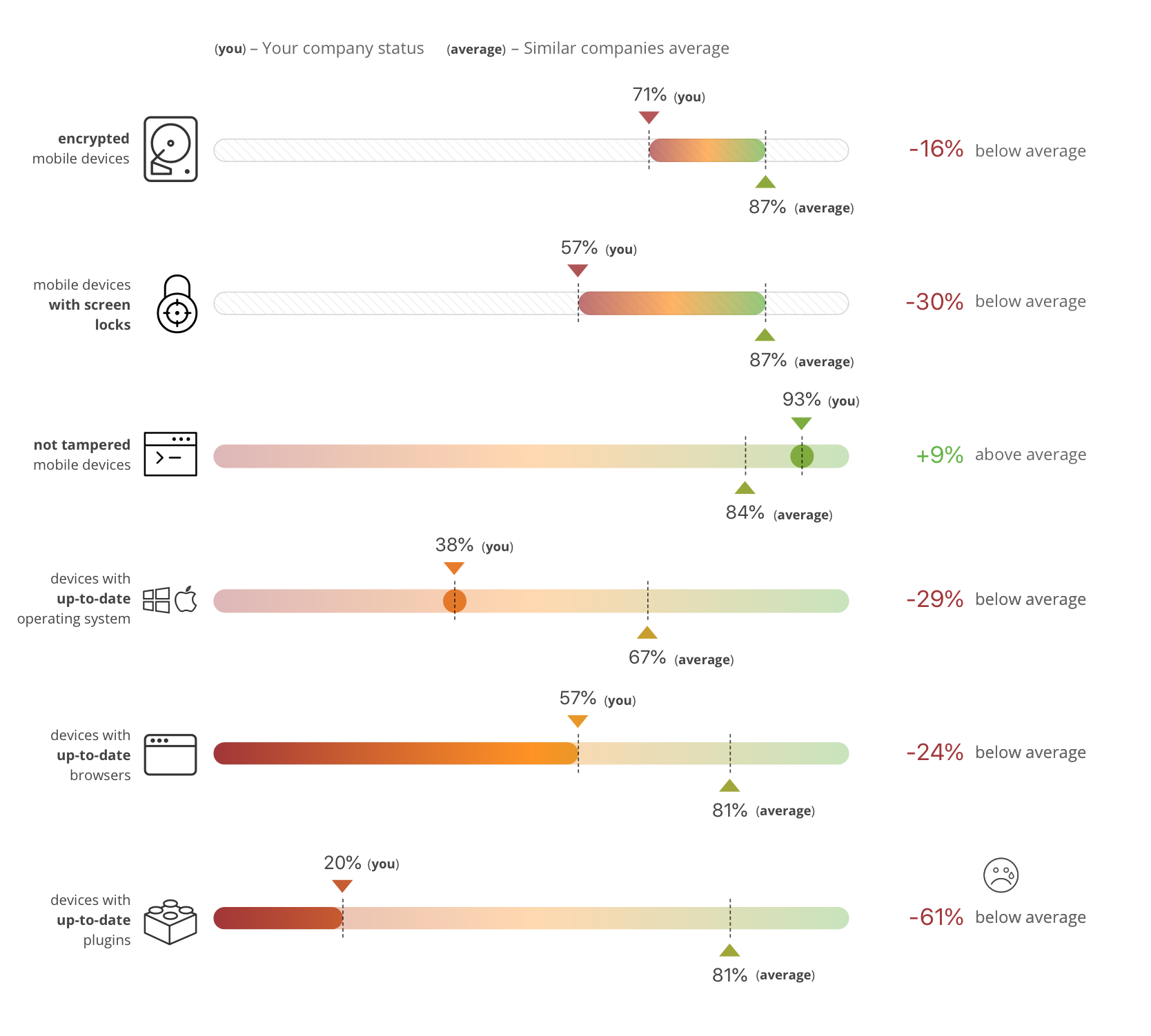
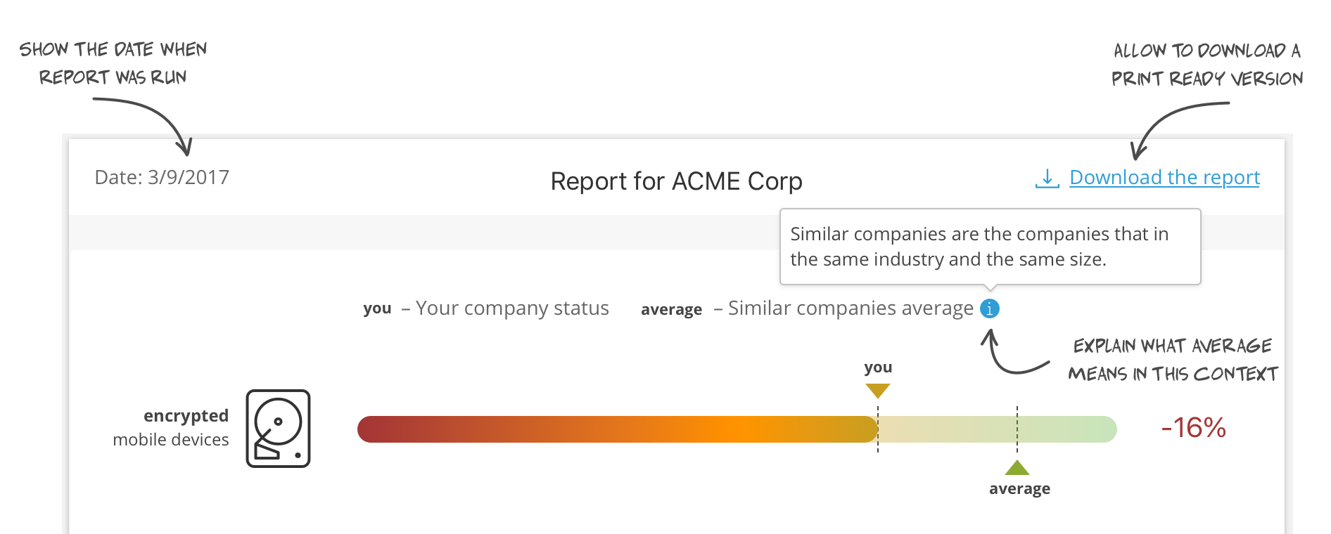
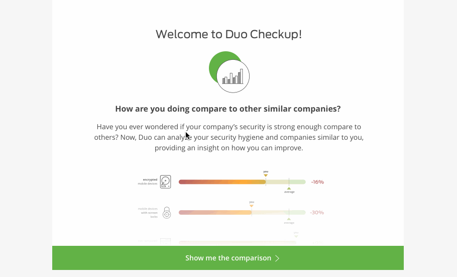
In this case I only had two variables to compare for each security posture criteria: Gary’s score and a similar company average. Putting two graphs next to each other adds cognitive load, and makes our user work harder to draw the comparison between two graphs. However, putting your organization’s score and average score on the same graph makes it much easier to compare.

What is the best way to convey how a customer is doing in security hygiene?

  • Raw percentages?
  • Score grades?
  • Emoticons?
  • Just plain words?
Paper sketch of visualizing the comparison of two variables

Hi-fidelity prototypes

Once I felt confident about the direction my sketches were going, I began working on hi-fidelity prototypes. We had to move fast for hack week. First, I iterated on different ways to visualize the comparison.

Explorations of visualizations

Then, I needed to identify what other information needed to be presented along with the data. From past customer interviews, I learned that Garys want to print reports. Also, he probably needed to know when the report was actually run. Lastly, an explanation on what we meant under “average” was necessary.

Additional information

Lastly, data is not useful if you can’t take action on it. I asked myself, how can I help IT administrators to get to a better place, get his score to be in a “green zone”? How can I make him to be proud of what he built? I added the section at the bottom of the report that walked him through leveraging the Duo product. This helps Gary to set policies around the criteria that report is showing.

Adding actionable information

Usability testing/UX interviews

I worked with a design researcher to test with 5 IT administrators who use Duo. We put the following questions together:

  1. What does this tool do?
  2. What do the labels on the charts indicate to you?
  3. What are your impressions of this information?
  4. Is any data not provided that you would expect to have displayed?
  5. In real life, have you ever needed or wanted this kind of information?
    • What was the situation that led to you needing it?
    • How did you ultimately get the information?

I put together an interactive prototype using Marvel App.

Interactive prototype animated

The results of the usability test.

Generally, the test was success. We concluded:

  • Users understood what this tool does
  • Users saw averages as marker of security posture
  • Users said tool useful for reporting upward, evidence for budget asks and “executives like pictures and graphs”

Some other interesting quotes/insights:

  • User 5 said it's impossible to do 100% "without making users hate you". These types of quotes help us to build empathy towards our Garys.
  • Users expressed interest in saving the results for comparison to self/others at later point.
  • User 1 wondered how Duo was getting the data. This reminds us that we always need to be transparent on how we collect and treat customer’s data.
  • User 4 wanted to see improvements over time.
  • User 4 wanted to be able to compare to other industries such as banking. When asked “why”, he clarified he wanted to strive for their score as banks should follow the best security practices and their security posture should be exemplary.